In this post, you will come to know 4 steps to professionally compare and analyze two different products, ads, and even wrtten stuffs. This post is mainly designed to teach advertisement analysis of two magazine published advertisements only.
Part I: Picking a Magazine
I am too much health-conscious man and I always followed the precautionary measures regarding health, food, and fitness. For this essay, I will not hesitate for any minute to select the magazine regarding my topic of interest, “Men’s Health”. Yes, my personal interest has attracted me to this publication. However, I am not too much familiar with this magazine because I had only purchased and followed since I came here in the U.S. But, I had read many similar magazines and blogs before as I already mentioned that I am too much health and fitness conscious. And it is always been the area of my interest to read and listen to fitness-related experts and professionals.
Part II: US Advertisement analysis Examples
Advertisement analysis of Lee Jeans: Introduction
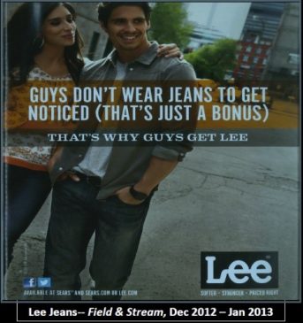
The first ad that I will prefer to be picked for the cover of the magazine is “Lee Jeans”. It is really suitable because most of the athletes or rather I can quote the Men’s health-conscious will always love to be noticed and they always try to be good dressed-up. The readers of the magazine will like this Ad because this will attract them to at least give it a try as it is matching with their personality basic trait of being observed or noticed.
Advertisement analysis of Ranch: Introduction

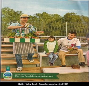
The second pick for the magazine is regarding food. The ranch is a very tasty salad dressing. I have used it personally and I always wanted to have it with fast food. The readers of the magazine will surely like it because every individual would like to test it after the work-out. The Ad is showing nature-friendly and happy living style. DAD with his Kid will not wait longer to get Ranch, the test when you’re working out. The will really work well with the magazine because the target market is the same for the magazine and the Ad.
Part III: Analysis of target audience
The target audience for Men’s Health is food, health, and style-conscious people. If we access the website of Men’s Health we can find so many posts and the Ads regarding batter and the tasty food, batter health and the batter style-related pictures plus titles and the whole content. For making stronger to the evidence if we just click on a link like Meater Is the Best Wireless Smart Meat Thermometer. Ever by Sean Evans published on 06 June 2018, we can find very interesting facts like in a very first look of the title it is really very hard for the fresh readers to quickly understand the title like what it is about. But later if we look at the published picture, we make an idea that the write-up is about food. But later when we read it, it made us that we just learned something new today.
The target audience for the magazine Men’s Health in context to the first Ad that I have selected above in part II regarding Men’s style is actually making dialogue with the style–conscious people/readers. This Ad has already been published in other magazines and blogs, every time this Ad is for the direct attraction of the style–conscious people.
The target market for the magazine, Men’s health in the context of the second Ad regarding Ranch, A Salad decorator, are actually the same people who love to test good food, and adventure lovers. Men’s health has a target market of the individuals who always wanted to be fresh and fit, and we all know that without fresh and healthy food it is never possible that someone is smart, fresh, and fit. So, those people who are working out with their families or individuals will always want to get fresh and tasty food after the work-out, and if it appears anywhere it will be million worth-keeping.
Part IV: Analyzing Ad features
Advertisement Analysis Worksheet
Category for Advertisement Analysis |
Advertisement 1 (Lee Jeans) |
Advertisement 2 (Ranch)
|
|
Details of the ad. What elements are included in the ad, and why are they included? (Why do you think the ad incorporates these things rather than other things? What effect are they designed to have on the target audience?)
|
The ad contains the logo of the brand, a quotation which attracts those who wanted to be noticed, and the stores from where individuals can purchase. These elements are included to make the ad simple and understandable. And these elements are enough to attract its target audience. |
The ad includes a man selling fresh food with Ranch, a type of salad, mixed up. Whereas a kid with his father is looking at that with so much awaited eyes. A natural environment is shown in the ad. The ad is also showing that we can use Ranch anywhere and in anytime. |
|
Social significance. What do the things and people included in the ad mean, socially and culturally speaking? That is, what associations might they have for viewers of the ad? Knowing this, why did the ad creators choose to include them?
|
The people in the ad are directing to sharing love and affection. The style of the man is showing adorability and the matter of attraction for the girls. The background is showing that the couple is standing in the middle of the street. The creator of the ad wanted do speak that this fashion is adorable and best for the outdoor usage |
The people in the ad are showing love and care for the family. Furthermore, it also speaks that best services are related to the best quality of products. If we look in more depth in the picture we can see that the elder member has his package but still waiting for the younger to get and waiting to start together. |
|
People in the ad. If there are people, how are they presented? What “story” can you read into the ad? What are these people doing What are there expressions, and what does that tell you about the emotion in the ad? What effect is this designed to have on the ad’s viewer?
|
The ad is showing to the two people, a girl who has kept her arm around the other shoulder of a boy which shows that Lee jeans, the brand, is very fashionable and an element of attraction to the girls/women around every wearer. |
There are mainly three people in the ad who are focused. A seller and two buyers. All three people have a smile on their faces and the child has some tight expressions as he would not wait anymore without getting the Ranch mixed food from the seller. |
|
Composition. How are the visual elements of the image arranged within the frame of the ad, and what effect does this have on the viewer of the ad?
|
The composition of the ad is kept very simple and not too much that can irritate to the readers or audiences. If the ad appears before the viewers and if they can even hold it for 5 seconds, I am sure viewers will identify the purpose of the ad that what it actually wanted to say. |
The ad has a green background and sports-loving people in it. Its effect on the viewer suggests that Ranch is a natural and healthy food mixture. |
|
Angle and Vantage Point. At what angle is the image presented, and what effect is this designed to have on the viewer of the ad? (For example, a camera focused in tightly on someone’s face or on a product helps to create an emotional connection with the viewer).
|
The creators of the ad have kept it under two dimension. They wanted to show the couple plus background. Whereas it has the wording just in the middle of the page which grabs the first eye of those who are text readers first. For viewers they can clearly see the boy in style, cuffs rounded, hands are in the jeans front pocket which shows the male dominancy. |
It can be assumed that the picture is a random click and has been taken without any prior settings. The people in the ad are in the centre of the picture frame whereas background shown from the top and a simple written line at the bottom of the page. The more focusing point in the ad is people and their natural expressions. |
|
Lighting and colour. What kind of lighting is used in the ad – is it shadowy, naturally lit, bright, and dark? What is the colour scheme? What effect might this have on the viewer?
|
The dark effect is given to the ad which shows the dominancy and level of attraction to the viewers |
The lightening effect is natural and bright, it’s either early of the morning or just before the sunset. It has the same natural effects on the viewers as well. |
|
Page design. What effects does the actual design of the ad – the amount of text, font style and size, placement on the page, lettering, etc. – have on the viewer?
|
The ad has a mixed style of text and visual. The font size is kept different as per importance, as the quotation has large font size whereas the availability and the tag line of the brand have smaller font sizes. This effects on the viewers that if they really wanted to be noticed they will surely read its details which is in small size. |
A very little amount of the text has been added in the ad. The creator has mainly focused on the body and facial expressions of the people who are included in the ad. Its effects on the viewers are always being happy with your family and get the real test of the food. |
|
Language of the ad. How does the text used in the ad connect to the visual images? What is the style of the language, and what effect might that have on a viewer?
|
A simple and understandable language has been used in the ad which is also matching to the visual effect of the ad as well. |
The simple language has been used in the ad. The text is really matching with the body and facial expressions of the visuals. |
Advertisement Analysis is a keen job of every marketer. This article not only analysis the advertisement, but also provides a direction which helps exactly how to conduct the advertisement analysis. Particularly the questions being asked in the first column of the advertisement analysis worksheet gives a complete sense and an idea to put them in front and just analyze accordingly.
Read AIDA and Rhetoric Analysis of TCS Video Advertisement and An other example of Rhetoric Analysis: Why I am Leaving Goldman Sachs
Comment below, if you have any question/idea or even objection.


